
Reaction and Redaction: An Inquiry into Kate McQuillen’s Unique Approach to Painting and Print
This very special artist feature arrives in two parts and was conceived of during the run of Kate’s recent solo exhibition A Thief with No Loot at Massey Klein Gallery in New York earlier this year. We have previously shared Kate’s work in one of our Womxn in Expanded Print interviews back in 2020, and wanted to again connect and dive a little deeper into the inspirations and references that are currently undergirding her work, as well as forging potential connections between the particularities of her painting process and the history of print.
Additionally, we’re including a wonderful review of A Thief with No Loot, from artist, writer and curator Amanda Nedham that offers a generous window into this new body of work and is an inviting precursor to our interview with Kate.
Hero Worship, 2022. Acrylic on panel 43 x 45 inches. Courtesy of the artist and Massey Klein Gallery, New York.
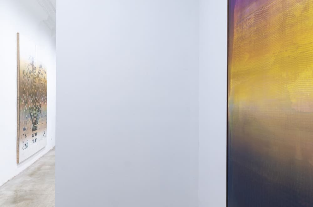
In Hero Worship you wonder if the classical torso–the only identifiable figural element in Kate McQuillen’s exhibition–is accidental. It seems to arise from an intelligent, primordial ooze, one on the cusp of civility, of poetry. Intention. The torso hovers in an emerald green field, top left, as if illuminated by a flash of lightning, setting the tone for an exhibition of abstract works, all uncannily narrative. One of the greatest commonalities across the eight virtuosic paintings is the feeling of fleetingness that carries you from one canvas to another, each in its own cross wind. The concept of narrative seems to apply to the artist's work as much as it does to natural forces, but just when you feel foolish for wanting to project words like tragic, absurd, dangerous, or heroic, you read that the artists influences include: Greek Attic potters and painters, French crime fiction of the early twentieth-century, post-punk bands, and Werner Herzog (she loves Herzog). Squint and it is all there.There are no accidents in McQuillen’s work.
Heroism appears to be the overarching theme, if you could ascribe one. This is reinforced by the centerpiece in A Thief With No Loot, a checkered abstract work that references Exekias’s Vatican amphora, one side depicting Ajax and Achilles engaged in a game of dice. It is unlikely you will recognize the figures originally imagined by one of the most renowned ancient Greek vase painters in the structurally dissolving composition, Four to Three. Using this friendly competition as a jumping off point, McQuillen has conjured in response hundreds of frenetic and clumsy ink squares that oscillate between pixel and checkerboard. Together they acknowledge the very nature of competition by blowing it up. The instability within Four to Three hints to a time pre- or post-gods. I can’t quite tell, but something beyond this millennia long blip where we compete beyond our needs, beyond survival, for pride and for glory.

Four To Three , 2022. Acrylic on panel, 90 x 72 in. Courtesy of the artist and Massey Klein Gallery, New York.
Perhaps A Thief With No Loot is a meditation on a world without heroism, the very notion of legacy treated with irreverence, suggesting that when these simple narratives come apart one is left with the guts. The guts are messy, but also much more interesting. They are no longer simply of the body, but are also made up of the cyber-metadata that shapes a person, especially through social media. This same abundance of information shapes painting that in turn can affect our psyche through: reckoning with the abuses that have and continue to silence voices; reflecting our most existential feelings both personal and social; providing a litmus of who we are now.. None of these super powers are tidy or without complexity.
Eight Ball Corner Pocket, 2022. Acrylic on panel, 56 x 48 in. Courtesy of the artist and Massey Klein Gallery, New York.
The soft interrogation of heroism permeates all the works, especially the most acrobatic painting Eight Ball Corner Pocket that seems to trace the physical movements of a fist? A storm? Or is it just the artist's staking claim? This piece hangs next to my personal favourite within the exhibition, Kylix. A rainbow of dozens of translucent and amorphous shapes are caught mid-motion, frozen in varying states of being. Are they real or after-images? Are they obscuring, or are they the reveal–ghost particles partaking in the dance of spooky action? In a moment where quantum physics is becoming pop knowledge, as evidenced by its employment in the Marvel Cinematic Universe narratives, McQuillen takes a microscope to the cultural phenomenon and doesn’t offer us tights, lasers, or time travel. Nor do we see love, pain, or triumph. The absence of heroes in the exhibition points to the fact that we all are, we all do. This leaves us simply with a show about the super. I have a feeling that if the beings in Kylix were to take pause, and look to the external world for entertainment they would not turn to Avengers: Infinity War, but to Cave of Forgotten Dreams.
– Amanda Nedham, 2023.

Slow-Talking Heroine, 2022. Acrylic on panel, 45 x 43 inches. Courtesy of the artist and Massey Klein Gallery, New York.
Ajax and Achilles Field, 2022. Acrylic on panel, 52 x 46 inches. Courtesy of the artist and Massey Klein Gallery, New York.
Print Club in Conversation with Kate McQuillen
PC: You have a printmaking background but your current work’s construction is more akin to painting. Can you describe how you landed on your very particular method of working?
KM: I’m in love with the language of print, the separation of layers, the intertwining of information. But I’ve also recently started to understand that my best ideas happen when I’m actively working directly on the piece, and not in a preparatory state. I have trouble seeing layers come together before the actual making–I think the greatest printmakers have this ability–but I’m not sure I do. So I sought out a method that allows me to use techniques and markmaking of print, but the approach of a painter.
One aspect of my process is that I use an absorbent ground which, when exposed to water, will act like a resist. Secondly, water can be used in subsequent passes to lift layers of ink to varying depths depending on the length of time it sits on the surface. Lastly, I’ve found ways to simultaneously lift ink at the front end of the squeegee stroke while also setting ink down on the back side of the stroke. All of these things allow me to erase and make marks at the same time, and therefore a variety of things can happen within each layer, allowing me to build images quickly.
PC: Having visited your studio I’m interested in the fact that you do a lot of your printing on the floor, there is a different sort of physicality working horizontally like this, do works move back and forth up onto the wall as you’re developing them? Can that be a transformative process?
KM: Yes, they do move from the printing floor up onto the wall, and it is definitely a transformative process–I sit with them and look at them for days or weeks before making my next move. I often refer to Amy Sillman’s description of Helen Frankenthaler working in “shots,” where she would go into a painting and destroy whatever was underneath with the subsequent layer. I think I work this way; every “shot” has the distinct possibility of the piece getting destroyed by the next pass. So when they are on the wall they are one thing, and when they go back onto the floor and under the screen they can change fully, across the whole image, with one or two passes of the squeegee. This is where the interest lies for me… the speed of it, seeing the image begin to emerge, and guiding it intuitively and on-the-fly.
PC: When you watch Richter making his paintings you can see him physically struggling against the weight and matter of the paint...or for R.H. Quaytman, she won’t make a painting larger than she can maneuver on her own. How does the physicality of the work’s production inform your choices regarding size and process?
KM: There’s an amazing video clip of Jack Whitten talking about having to stop using his developer tool when it just got to be too much on his body… I think about that a lot, and when I might hit that point. But I think this ultimately happens to lots of printmakers. All of the repetition involved, even on a small scale, is tough on the body over time.
PC: You shared a couple of articles for us to read in preparing to chat and one theme that kept arising throughout was the idea of negation, removing previous work or layering on top and erasing previous imagery - these all seem like apt considerations for your pieces. How much pre-planning can take place and how much does the work require responding to, erasing, re-working during the process of its production?
KM: I do love working reductively, and in my process, the marks I make on the surface often result in the reveal of a white line rather than laying down a positive; I’m often working around this, and coming up with strange ways to coerce positive marks into the piece. I think my love of negative markmaking was something that clicked with me when I first tried printmaking. I’ve always been intrigued by how printmakers learn to see things in reverse and in the inverse while making. It’s a weird positive/negative shift in the mind. So I think that appears in some of the visuals here… negative lines, erased marks, merged layers, all flattened out onto one surface.
PC: In numerous pieces, the application of paint through the silkscreen leaves a moire, is there any reference there for you in terms of the mechanical visual histories related to moire patterns?
KM: Not exactly to moires, but I feel it is more like a nod to painters who’ve harnessed things that we would consider printing mistakes or reveals: like the feeling of a clogged screen that you might get when looking at a Jacqueline Humphries, or Christopher Wool’s precisely separated screens in his paintings. And of course Warhol’s mis-registration.
PC: When painters move into printmaking it’s typically through monoprints but you’re drawn to silkscreen which has an industrial background and different cultural baggage, why this choice?
KM: I was a head screenprinter at a gig poster shop in Chicago called Baker Prints. The shop was set up brilliantly and the founder, Kyle Baker, is kind of a screenprinting wizard. I learned a ton from him. And he had learned from the legendary Steve Walters, who has made some of the greatest gig posters ever, in my opinion. Anyway, we would produce literally thousands of posters in a regular work week, and I really learned the technicalities of screenprinting from Kyle on a minute level. We used a semi-auto press where you would control printing down to details like stroke speed, flood speed, squeegee durometer, etc. Through watching that, I came to understand the squeegee as a super-precise but also incredibly simple tool. I now use that as a way to flatten and unify my own images, reducing everything to a superflat surface.
PC: Historically and industrially, printing is used as strategy for reproduction, but in your process it is a device through which you’re building something entirely new from nothing - much like a painter. When potentially recognizable imagery appears in the work is that due more to happenstance or are there ever forms or images you’re actively trying to incorporate into the work? I’m thinking of your new piece Four to Three where there appear to be a more deliberate arrangement of forms but it remains a little slippery in terms of a specific reference.
KM: One way that I’ve found to incorporate pre-planned imagery is with paper stencils. Instead of using them as a blocking tool, I soak them in water to the point of full saturation, and then lay them on the absorbent ground to create the resist.
The piece titled Hero Worship is an example of one rooted in a handmade paper stencil. I had been working on tearing loosely figurative shapes. One emerged that felt a bit like a torso, and decided to give it a try in printing. I turned out really well, and the rest of the image built from there, with additions of something like an electrical fog of lighting. This is also the piece that sent me down a rabbit hole of Greek vases, and seeking a sense of something that feels ancient and contemporary at once.
After that piece, I decided to use a laser cutter for a large-scale paper stencil, which is totally visible in Four to Three. This is probably why this piece has such a different feel; it uses a much more precise and representational tool to create the image. And yes, this piece was referencing a Greek vase that I had become really obsessed with called the Vatican Amphora, in which Ajax and Achilles are engaged in a board game. I kind of merged the idea of their checkerboard with that of a vase, resulting in something that also feels like flowers. And it has a sense of a bitmapped composition, a kind of shoddily-formed computer graphic, dissolving and reappearing in places.
A big thank you to Kate McQuillen, Amanda Nedham and the team at Massey Klein Gallery. The online viewing room for A Thief With No Loot can still be accessed via the gallery’s website.
View more of Kate’s work, as well as her writing and curatorial projects on her website.
Dust Up (detail), 2022. Acrylic on panel, 52 x 46 in. Courtesy of the artist and Massey Klein Gallery, New York.
Further Reading

The Print Club Journal
Never miss a story from the studio
Printshop tours, artist interviews and guidance for building your collection — delivered to your inbox. Join our mailing list for new Journal articles and the occasional note from the studio.
Join our mailing list