
Authoring a Space: Café Frieda at the Frye Art Museum
We’re sharing how we combined our art consulting experience with our own site-specific fine art practices to create a museum cafe at the Frye that is both contemporary art installation and an act of re-invigoration for a multi-use hospitality space at the museum.
When Jamilee Lacy, Executive Director of the Frye Art Museum in Seattle, invited us to work on the museum’s cafe; MariPili at Café Frieda, she was clear from the start about the kind of project she wanted. It would be both a decorated interior, and a commissioned art installation. The cafe sits within the museum, and Jamilee wanted to ensure that our design would be developed with the same level of rigor that any work shown within the Frye’s galleries would. So, from the first conversation we were thinking about the room like an artist commission: wall treatments and objects made specifically for the space, that all contributed to an overarching narrative and made clear reference to regionality of MariPili at Café Frieda’s Galician cuisine.
All images are Courtesy of Frye Museum of Art. Photo Credit: Runyon Colie.
A view through to one of the two dining areas at Café Frieda.
Graham and I have worked with Jamilee for many years. She curated solo exhibitions with each of us during her tenure as Director of Providence College Galleries, and more recently brought us both into Wallflowers, a group exhibition that she curated at the Frye. She is a long-time collaborator, and much of her curatorial work circles around how fine art and decorative arts overlap and cross-pollinate. In many ways, the brief made complete sense coming from her. Rather than hiring a design consultancy to dress a room, she was asking two artists to author one.
We couldn’t alter the envelope of the cafe. The footprint was fixed, and the existing millwork, doors, windows, furniture and grey plaster walls couldn’t be permanently changed. In a museum the building is part of what’s being protected, so we couldn’t make any of the usual renovation moves like shifting walls, refacing surfaces or rebuilding joinery.
A view of the long expanse of drapery that features our bespoke pattern repeat. Behind the curtain is a run of wood joinery that couldn’t be altered, so it is instead enlivened by the colorful fabric wallcovering. Photo: Runyon Colie.
What that left us with was everything we could add to the room without altering it: the textiles, the ceiling, the ceramics, the backsplash, the “florals”. And that constraint is really what made Jamilee’s framing the right one. Because we couldn’t change the bones of the room, we had to give thought to which kinds of gestures were going to have the most visual impact and we knew our designs had to begin and end with the story of the food.
Café Frieda is run by chef Grayson Pilar of MariPili, whose cooking is rooted in the food culture of Galicia, the coastal region in northwest Spain where seafood, produce and meat are foundational to its whole identity. Before we touched a swatch or looked at a single tile, we spent real time with that provenance, which thankfully included a meal at MariPili itself, and it was genuinely absorbing research. Galician cooking is inseparable from its landscape: the rías, the estuaries, the market stalls stacked with barnacles and octopus and the particular range of vegetables that come out of Atlantic soil. It’s food with a very specific geography behind it, and that geography turned out to have a rich visual language of its own.
It also had a ceramic tradition we kept being drawn to. The blue and white pottery made in Galicia, with its bold geometric patterns and a particular quality of hand to the mark-making, is one of the region’s most distinctive material signatures, and Grayson had given those pieces pride of place on the walls of the original MariPili restaurant in Seattle. They clearly mattered to her sense of the restaurant’s identity, and we took it seriously as a brief in its own right.
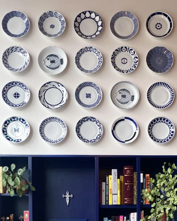
Plates hung on the wall of the original MariPili tapas bar in Seattle.
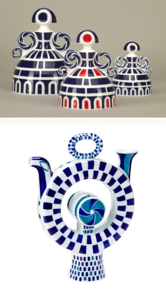
Sargadelos porcelain ceramics from Galicia. The bold geometry of these pieces heavily influenced the design for the curtain fabric repeat.
The drapery pattern grew out of those two things meeting. We designed a custom fabric repeat that drew on the visual world of the Galician kitchen, its produce, its seafood, its meat as raw material: the geometry of a scallop shell, the curve of a prawn, the recognizable shapes of cows, pigs as well as the Galician coat of arms, all rendered in repeat. But the language of the pattern itself, the way the motifs were structured, the rhythm of the repeat, the way the elements locked into relation with each other, came straight from the blue and white pottery tradition. The result reads as contemporary pattern design, but there’s a clear cultural argument running underneath it, and anyone who knows MariPili, or who has spent time in Galicia, would feel that reference without necessarily being able to name it.
Having our own design and print production background was essential here, because this wasn’t a brief we could have handed to a fabric supplier with a mood board and hoped for the best. The repeat went through round after round of iteration. We worked through the density of the motifs, the relationship between positive and negative space, the way the geometric structure held together or started to break down at different scales. It was design work in the proper sense, the same kind of internal process we’d run for an edition: considered, iterative, and defensible at every decision along the way. We then handled the pre-press and oversaw the digital fabric printing ourselves, so the move from screen to cloth got the same scrutiny as the design that came before it. The finished fabric was sewn and expertly installed by Lesley Petty Studio in Seattle, who brought exactly the kind of care to the making and hanging that the project deserved.
Early colorways that were rejected and some alternative methods of illustrating the sea creatures, some using watercolor techniques and others filled with a “crazy paving” pattern.
A portion of the final curtain repeat.
A view through one of the tall café windows out to the water feature at the entrance to the museum.
We commissioned the custom ceramic vessels from Kassandra Guzman of Kuu Pottery, and the decision to commission rather than source came from the same logic as the drapery. We wanted pieces that belonged to the space’s argument, not pieces that just happened to be compatible with it. Kassandra had previously been based in Seattle and already had work in the Frye’s own museum store, so there was already a connection to the institution, which felt like the right kind of alignment.
The “florals” are worth a quick explanation, because it tends to be the thing people ask about when they visit. The arrangements sitting in Kassandra’s vessels are entirely sculptural. We made them in the studio, and while they clearly nod to botanical arrangements in their form and material, they’re not trying to pass as living plants. They carry a certain unpredictability of form that is a nice juxtaposition to the more hard-edge geometry of the fabric repeat.
Custom ceramic vessel from Kuu Pottery featuring one of our original “floral” arrangements.
Because the plaster walls couldn’t be touched, the ceiling became the one big surface we could paint on. We commissioned Rocky Road Studios to paint a ceiling mural to a design we developed in-studio, a large-scale composition inspired by the visual structure of floating fishing nets, which brought us back, once again, to the Galician coast and the Atlantic landscape behind Grayson’s cooking. The mesh and drift of nets on the surface of still water, the geometry of their structure when light filters through, that was the image we kept coming back to, and it gave the mural its underlying architecture. It reads as abstract when you first walk in, just field and pattern and a sense of slow movement, and then it gradually resolves into its source the longer you sit with it.
A view of the ceiling mural, the drifting net had moments where it appeared to be pulled towards a corner.
The drinks area, featuring a tile backsplach inspired by the palette and geometric pattern of the curtain design.
For the backsplash in the drinks area, we chose tiles from Fireclay Tile, working through the options to find a palette that sat alongside the fabric and the mural. The colours we landed on echoes the blue and citron of the drapery, and the shifts in tile scale rhyme with the geometric shifts in the drape repeat.
The Frye’s operating schedule shaped the install almost as much as any design decision, because all of the work had to happen on days the museum was closed to the public. The timeline was built around the Frye’s calendar rather than around the most efficient construction sequence, which meant coordinating carefully across every element, the drapery fabrication, the mural progress, the ceramic delivery, the tile work, so that everything landed in the right order inside the windows that were available to us.
A view of one of the two café dining spaces.
A moment for the bespoke curtains, custom powder-coated steel wall shelf and ceramic vessel from Kuu Pottery.
We’re great lovers of interior design as an industry and would have felt genuinely out of our depth if the pitch from Jamilee had been to “redesign” the space. For whatever reason the idea of an art installation was something we could more easily wrap out heads around – even if a lot of what we worked on was indeed interior design! We designed a bespoke textile, a ceiling mural, we commissioned ceramics from a maker working to our brief, and interfaced with printing and fabrication vendors ourselves. Every element was either originated or directly directed by our studio, which, ultimately made the process all the more gratifying.
MariPili at Café Frieda is a perfect example of what opens up when a client starts from what a space should mean rather than what it should look like, and trusts the people they’ve commissioned to answer the first question properly. In our experience the answer to that question usually contains the second one anyway, whereas starting from appearance alone rarely gets you anywhere very interesting.
It is also, looking back, a direct expression of the idea Jamilee is often interrogating: what happens when the decorative arts are made with the intent you would bring to fine art? The whole room is built from media that tradition tends to file under decoration, treated here as the work itself. Being asked to do that, by a curator we have worked with for years and an institution that holds that standard across everything it produces, meant a great deal to us, and we’re grateful for the trust it took.
If you’re working on a specialty hospitality or residential project where the space requires more than sourcing and the real question is what a room should mean and be made of, we’d love to talk.
We only take on a small number of projects of this scope, and an early conversation can be the first exciting step. Contact our Director, Liz Corkery liz@jointheprintclub.com
The Print Club Journal
Never miss a story from the studio
Printshop tours, artist interviews and guidance for building your collection — delivered to your inbox. Join our mailing list for new Journal articles and the occasional note from the studio.
Join our mailing list